Background
The goal of this project was to modernise navigation of the app to better support the growing number of features and services that had been added over the years since the first version was build in 2010.
When the app was initially build, it was based on a few key features (e.g. account statement, payment and transfers) that would help the user to easily manage their everyday banking. However over the years the scope was widened incrementally until it became obvious that the navigation no longer supported the app in a usable way.
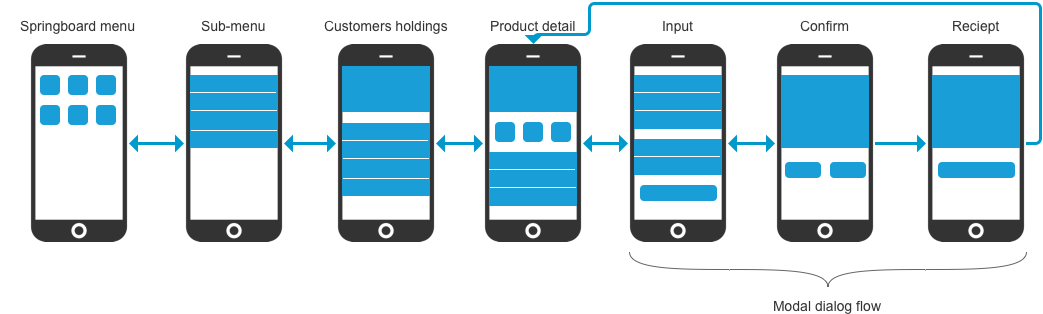
Once logged on the user is presented with the start view (Springboard menu). This is where the original version of the app used a so called 'springboard navigation' which has a selection of buttons (icons that represent the top-level navigation). The advantages of this type of navigation is that it ends up being the sole focus within the view. There is no question of where the user should click which makes the app easy to navigate.
The problem occurs when the user needs to perform several different tasks within a single session. The constant requirement to have to return to the start view to navigate causes frustration for the user. The app also used transitional sub-navigation pages for each main area. This created an even 'deeper' hierarchy by adding one more click on the back button to reach the top-level navigation (illustrated in the image above).
Choosing a new navigation
By applying a new navigation we wanted to do more than just make it available throughout the app. We wanted to go one step further and allow the user to perform his or her everyday banking without having to use the main navigation at all.
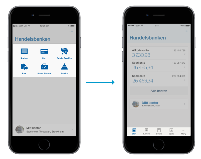
To achieve this the choice of navigation ultimately came down to either a drawer menu (hamburger menu) or a bottom navigation. Both allowed the user to easily access the navigation throughout the app but it also freed up the start page to allow us to add content highly prioritised to the user and the business.
After researching app navigation as well as conducting usability tests we concluded that the best solution for the app navigation was to use a bottom navigation. Since this type of navigation generally support only five menu options we added an additional drawer menu that could be accessed though the fifth menu option, should there be six or more menu options in the specific instance (app) using it (see right image above).
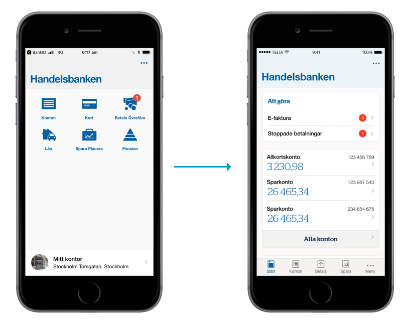
Selecting this option rather than a 'pure drawer' menu increases content discoverability as well as decrease time to navigation.
The long term goal of the start page in terms of content and functionality lay outside the scope of the navigation project. Instead we focused on proposing a new design that considered the most used functions in the app. This data was easily acquired using google analytics as well as stakeholder interviews.
Putting sub-navigation in context
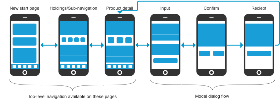
To further reduce the depth of the app the design decision was made to merge the sub-menu page with the customer holding page into a new 'Holdings/sub-navigation" page (where possible).
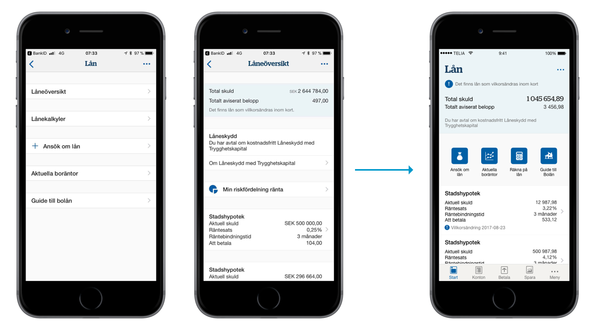
This was motivated by the fact that in most cases the customer wants to look at his or her holdings (account balance, super/pension, loans or investments) rather than actually buying something. At the same time, the need for an action such as buying a mutual fund or transferring money between accounts will more likely arise after first accessing the holdings.
The result
The top-level now became available on all pages (except in the modal dialog flow). Combined with the new holdings/sub-navigation views, the customer is able to easily navigate within the app without ever having to go back to the start page.
Furthermore, the design of the new start page provided the user with a better general overview as well as the possibility to take action on more urgent and important events.
New login page
Since most of the interaction with the app (including the main navigation) takes place once the user has logged on, a redesign would create a inconsistency with the login page. For this reason the decision was made to redesign this view. This opportunity allowed us to address the need to modernise the view as well as put more focus on the key interaction (that is to log on to the app and access its main features).
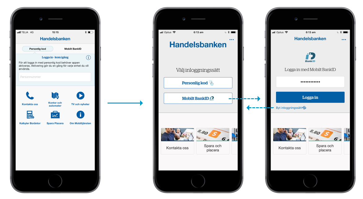
We achieved this by giving the log on area an increased focus, while also prioritising the currently selected method of authentication (the Swedish app used two different methods - PIN or BankID). The hypothesis, later supported by data, was that once the desired authentication method was chosen the user was unlikely to change it.