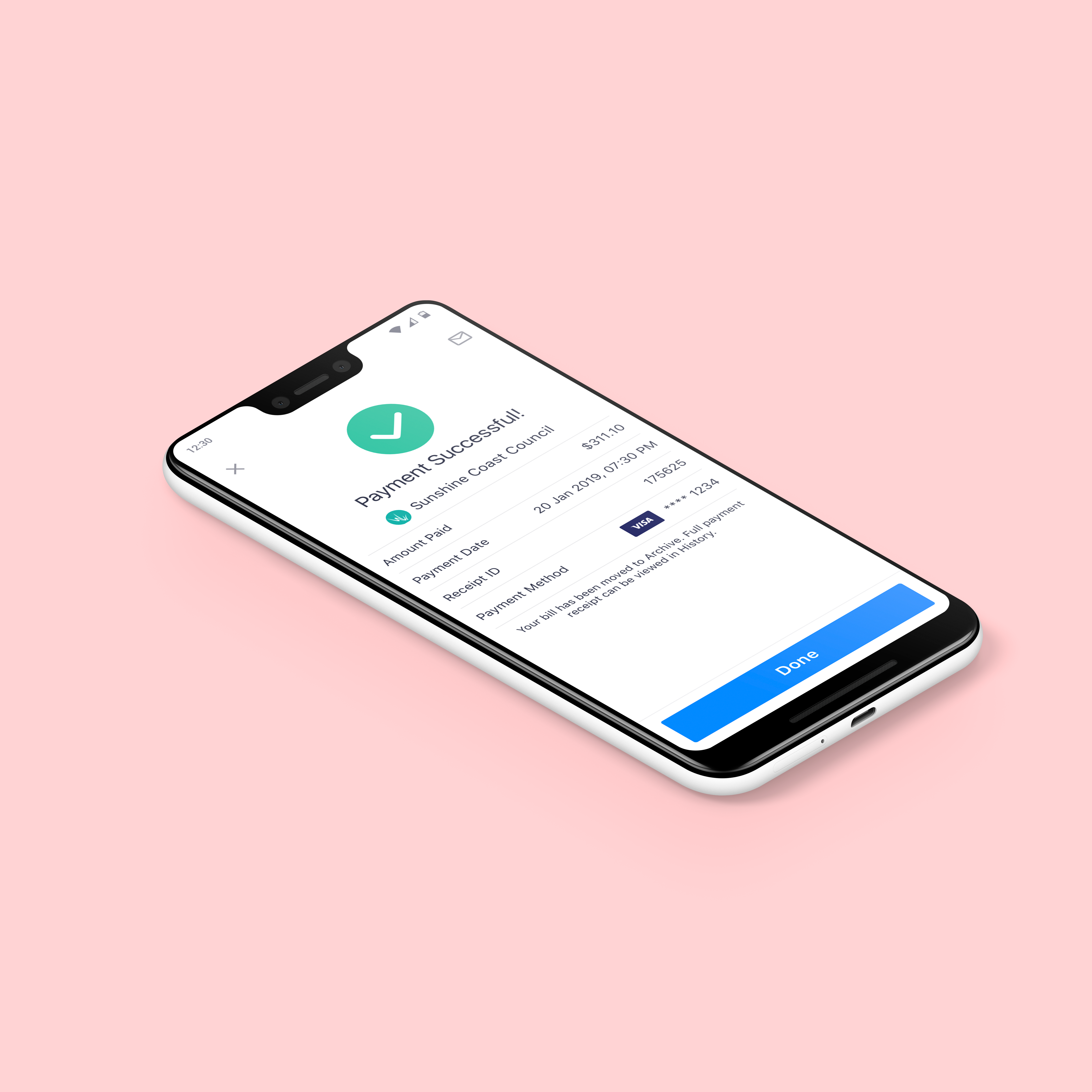
I was responsible for designing a UX for customers who wanted to add their electronic bills to the app without using the built in bill scanner. This included everything from research and wireframes to pixel perfect design.
Project background
Sniip is a B2C app that allows billers to send their bills to customers and for customers to pay and manage all their bills in one single app. The company core product is their native app. The app allows users to convert paper bills into digital bills by using the build in scanner, which can then be managed and paid via the app. Prior to adding BPAY as a way of paying bills, Sniip relied on their own QR codes to capture bill information from partnering billers. These provided all necessary bill data such as; biller information, bill amount and due date. With BPAY, the company went from being able to pay five billers to approximately 45 000 overnight. The downside to this feature improvement was that the scanner had to rely on using optical character recognition (OCR) software to scan the information. This meant the customer could only get basic biller information excluding additional information like the amount and due date.
Through feedback from customer support as well as user interviews, we managed to identify pain points in the customer journey for adding bills to the app. It quickly became obvious that less and less bills were being delivered in paper format, and instead through email or through a third party app (usually as a pdf). Some users had found a way around this, by either printing the bills themselves or by using two devices - one for displaying the bill and one for scanning the bill. These solutions seriously compromised the user experience and thus the Sniip brand.
The introduction of BPAY and the OCR scanner had also created additional work for the user, where they had to manually enter bill amount and due date before the bill could be added to the app.
My role was to design a UX that solved these issues and allowed the user to easily add the bill to the Sniip app without relying on paper bills or multiple devices.
My responsibilities
● Requirement gathering
● User flow and lo-fi wireframes
● Prototyping
● UX documentation
● UI documentation and design library updates
● Handover to developers
Gather requirements
Having accumulated a lot of feedback and feature requests from customer support as well as insights from interviews, the high level requirements were quickly established.
1. Create a Sniip digital bill from a non-paper bill (such as a pdf file)
2. Review and edit to make sure the bill details are correct
3. Remove any unwanted or faulty bills
4. View original bill details (information contained in the file from which the digital bill in Sniip was created)
Ideation
Since there are different ways of solving this problem, an ideation session was planned to generate ideas and identify the best approach to a viable solution. All solutions would share a technical challenge, which is to convert the actual file into a digital bill in Sniip. Therefore, this was not considered in our session.
While all solutions were considered viable and something that could be implemented down the track, we decided to prioritise the 'Share/Send' solution. This would create least effort for the user while using common native functionality. It could also work as an introduction to the import functionality as a whole and make it easier to sell the 'Connect' solution to the user once understanding its benefit.
Competitor research
While there were no other apps that provided this functionality, we could still find some best practise and learn from how the share/send functionality was executed. Two approaches were identified; the user would either use the share functionality and then jump across to the destination app to continue the process there, or just stay on the screen of the file which they just shared. In our case, we decided to go with the first approach since it gave us a better control of the UX and the possibility to further help the user understand the value of this service.
User flows and story breakdown
Once the ideation was finished and the team had decided on the prioritised solution, I continued to create the user flow with low-fidelity wireframes to illustrate the user journey.
After establishing the user flow, I continued to mirror this flow in Confluence by creating pages for each screen that would later contain all UX and UI related documentation. This also allowed me to add more detailed requirements and communicate my design progress to the team.
Design and prototyping
Using the existing design libraries, I created high fidelity designs that could be used for prototyping and user testing.
I then used the prototype to run usability testing. While the testing results were positive and only required minor adjustments to the design, the main usability issue was for the user to understand that this functionality could be accessed in the first place. This would require further effort for the design and marketing teams to communicate this new functionality to the user at launch, as well as some contextual on-boarding for existing and future customers.
Handover to developers
Once all the designs were done, I completed the UX design documentation in Confluence by adding annotations describing all the business rules and interactions. I also linked to UI documentation in Zeplin so the developers could inspect the pixel perfect design.
Applications
◆ Sketch (UX and UI design ideation and final design)
◆ InVision (prototyping)
◆ Confluence (requirements, UX and UI design documentation for handover to developers)
◆ Zeplin (detailed UI documentation for developers)
◆ Slack (team communication and UX/UI shoulder checks)
◆ JIRA (creating design stories to prioritise and manage design work in each sprint)


